When you rent a TV or monitor for digital signage, you’re renting a blank canvas. The design of your content is what takes your monitor from a big black box to an engaging, attention-grabbing home for your message.
However, if you don’t have experience designing digital signage, there are a few key design tips to keep in mind. After renting thousands of TVs and monitors for events over the years, here are our top design tips for digital signage content at events.
Digital Signage Dimensions
Before you start designing, make sure your canvas is set-up correctly.
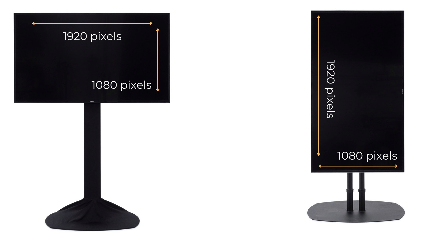
Use a 16:9 Aspect Ratio: An aspect ratio is an image’s ratio of its width to its height. No matter which size TV you rent, it will always be in 16:9 ratio, unlike projector screens (some of which come in a 4:3 ratio.)
If you’re using PowerPoint or Google Slides to design content, the default setting is 16:9, but it’s always good to double check under File > Page set-up.
Use 1920px x1080 px as your dimensions: In your design program, set your dimensions to 1920px wide x 1080px tall (or 1080 x1920 if your monitor is vertical.)
The only exception is if you’re renting a 4K monitor. A 4K monitor has more pixels than an HD monitor of the same size. Your dimensions for a 4K monitor should be 3840px wide x 2160px tall. Here’s a detailed guide on TV resolution that describes more about the differences between HD and 4K content.
As far as choosing the right size monitor, here’s more about how to rent the right size based on your content, your budget, and your venue.
Digital Signage Layout & Hierarchy
Clear hierarchy is important for any design. For digital signage, it’s especially important because hierarchy quickly communicates what’s most important, and in what order, so the viewer instantly gathers meaning.
Start by ranking each element on your signage from most to least important.
For example, let’s say your monitor is displaying the time of the next session. Rank the importance of the speakers’ name, photo, time, location, conference logo, and description. From there, emphasizing different elements in your hierarchy can be achieved through sizing, color, contrast, placement, typeface, and negative space.
 |
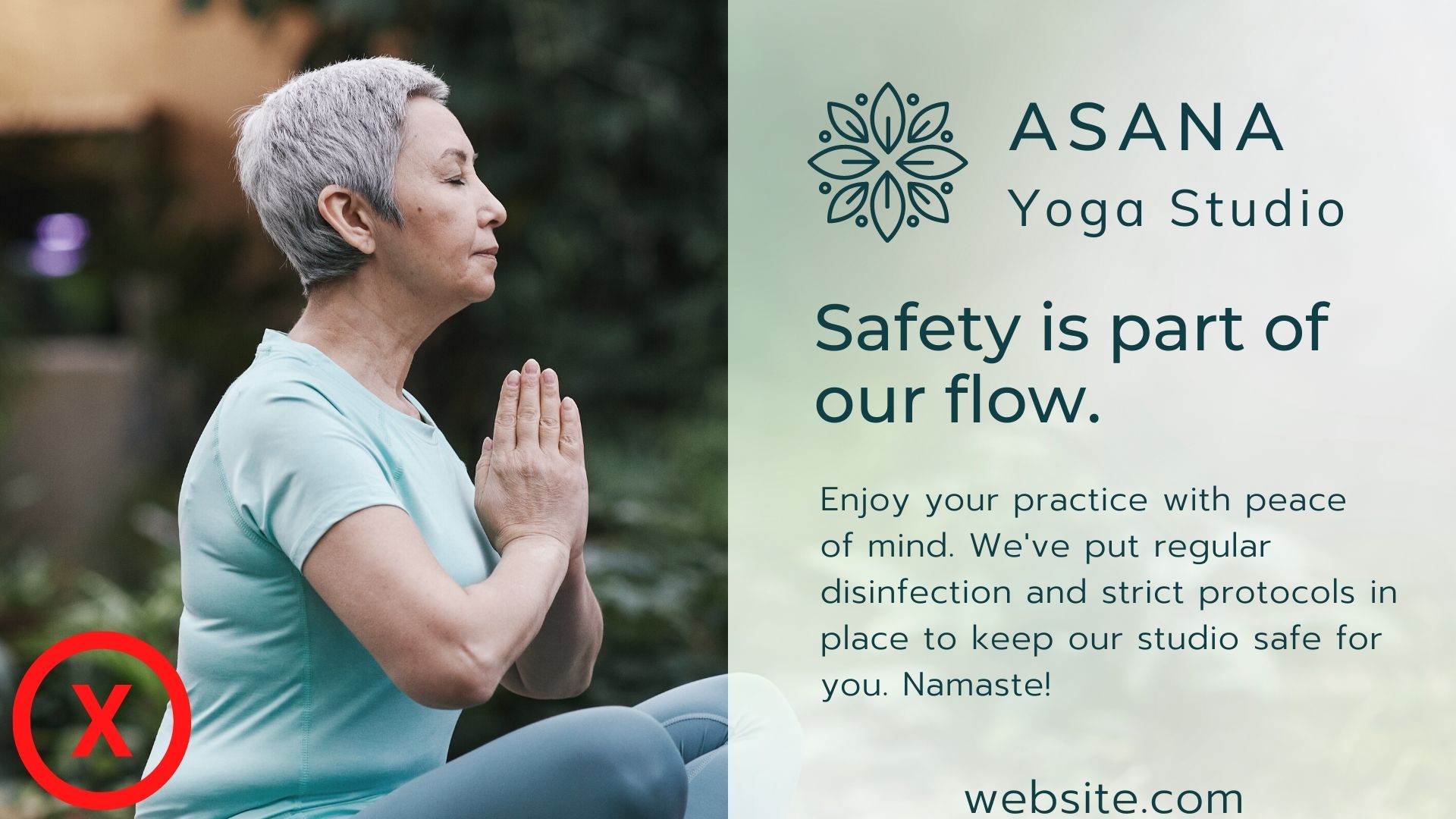 |
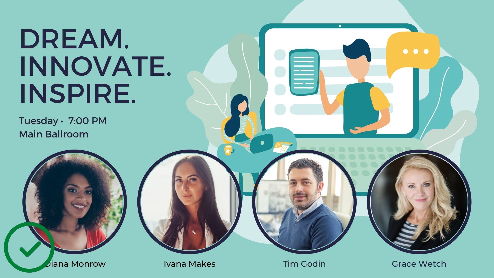
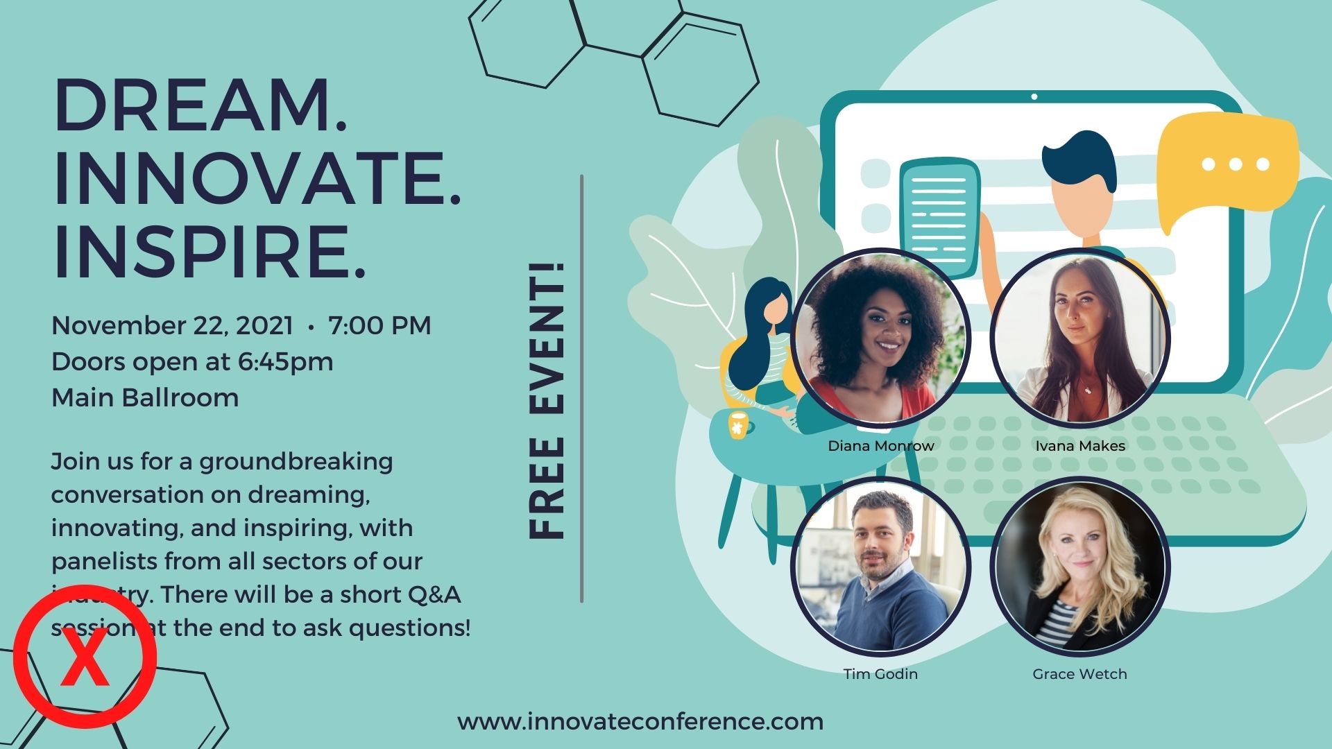
For example, with the example on the right, there’s no clear hierarchy of information. The slogan is lost because the description, logo, and website are all a similar size.
Increase the Contrast
Unlike paper signs, a screen’s ability to show contrasting colors actually changes with a person’s viewing angle. Ensuring maximum contrast between background and text will make your content clearer at more angles beyond viewing the signage head-on.
Also: To be in compliance with the ADA, all digital signage must have at least a 70% contrast between the background and the actual lettering in the on-screen messages. Here’s a great tool for quickly testing if your contrast is ADA compliant, and able to be seen clearly by people with visual impairments.
 |
 |
Design for Dwell Times
Dwell times are how long you expect the average attendee to see your digital signage. Though research varies on dwell times for digital signage at events, the overall consensus is that you don’t have long to catch your attendee’s attention — probably under one second.
However, location and placement does matter. If your digital signage is at eye-level is in a waiting area, you can assume a longer dwell time than if the monitor is in a busy walkway.
Shortest term (only a second or so): Busy walkways, entrances
Mid-term: Registration line areas, food and beverage/eating areas, trade show booths or lounges
Longer-term: Product demos, waiting areas/lounges, wayfinding
If you have a short term dwell time, you’re going to want to keep your content as simple and streamlined as possible. While longer term dwell times may allow for more complex or detailed information.
Dwell times also impact how long your total rotations should be. In busy areas, it may be best to stay on one static image or keep a total rotation of content to just a few seconds. In slower areas, you have more space to show additional content and the total loop can be much longer.
Design for the Correct Viewing Distance
Get out your tape measurer and figure out how far your attendees will be viewing your content from. Keep in mind: It’s possible you’d like them to stand only 3 or 4 feet away and check out your content, but the reality may be further (especially in a socially distanced world!)
You also don’t want the font to be too big for signage people are reading close-up. Font that is too big for closer viewing distance feels unnatural and is difficult to read.
UCView has a great chart for estimating minimum font size:
| Distance from Screen | 10ft | 15ft | 20ft | 25ft | 35ft |
| Font Size | 20pt | 34pt | 50pt | 66pt | 100pt |
Simplify!
Simplify your content as much as you possibly can. Then, simplify it more. Remember: When someone sees your digital signage, they need to absorb the meaning instantly. Simple messages are recalled more easily than complex ones, and adding too many design elements puts you at risk of your message being incomprehensible.
Tip: Is your design getting too text heavy? ScreenCloud recommends using the 3×5 rule. Stick to three lines of text with a maximum of five words per line. (Or vice versa: five lines of text with no more than three words per line.) This isn’t a hard and fast rule, but a helpful strategy to try.
 |
 |
Consider Adding Movement
Research shows attention time is significantly higher when your content is dynamic rather than static.
Dynamic content doesn’t mean you need an elaborate video shoot. Instead, try incorporating animation and other subtle movement effects if (and only if!) it enhances your message. Make sure that the motion doesn’t interfere with meaning or clarity, but that it helps draw the viewer’s eye to what’s most important, and stands apart from other static images surrounding it.
You can even add movement to your text using free tools like Canva or Animoto to bring your text to life.
Static Content |
Dynamic Content |
Don’t Design for the Designer!
Don’t design for designers — design for your event attendee! Think about what they need to know. Do they need to know exactly when and where the keynote is? Do they need to understand exactly what your product does at-a-glance? Do they need a reminder to stay 6-feet apart for COVID safety?
Put all your effort on clarity, and let more fancy design techniques come secondary. Happy designing!
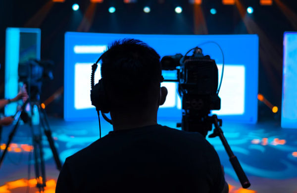
Top photo: @CollisionConf
Are you looking to rent a TV / monitor or other digital signage solution for an upcoming event or trade show? Get in touch with us here and we’d be happy to learn about your event and set you up with everything you’ll need!